Erik Nitsche

Erik Nitsche’s life spanned the twentieth century. He was born in Switzerland in 1908, moved to the United States at the age of 26 and died in 1998. In the meantime, he created a body of work that is pivotal to any conversation about the modern movement in graphic design. Swiss without being Müller-Brockmann. Playful without being Saul Bass. Clean without being Paul Rand. His style is decidedly Nitsche.

Below is a sampling of Mr. Nitsche’s work for General Dynamics, for whom he created an exhaustive corporate identity between 1955 and 1965. For more on his life and design prowess, check out Steven Heller’s article on Typotheque entitled Erik Nitsche: The Reluctant Modernist.

Carroll Shelby, 1923-2012

“I never thought about dying…

The day you were born, it was already written down the day you’re gonna check out. Now, I’m not gonna throw myself under a truck, but I’m not gonna worry about when I die. I’m ready to move on when that day comes.” 


Long before the prefix ‘i’ on a computer or digital gadget had come to conote a certain prestige — a whole different plane of excellence — having the word ‘Shelby’ before the name of an automobile meant you were dealing with the absolute best. The Texan tinkerer is a striking figure in industrial design and automotive engineering.

Carroll Shelby was born with a bum ticker. A leaky valve in his heart kept him in bed through the age of fourteen. He was determined to catch up — and then some. He joined the Army Air Corps in World War II and developed a lifelong love of going fast. He drove Formula One cars throughout the fifties, competing in eight World Championship races. Driving in his trademark bib overalls, he set multiple land speed records and was named Sports Illustrated’s Driver of the Year in both ’56 and ’57. When his heart condition forced him to give up driving, he began constructing his own supercars to compete with the likes of Ferrari and Porsche. In a sport dominated by Italian cars, Shelby gave American steel the pole position. Beginning with a British classic — the AC Cobra — the eponymous builder produced a string of hits including Ford Daytonas and GTs. His rendition of the GT40 won the grueling 24-hour endurance race at Le Mans. Later in his career, he found mass-appeal when he helped create the Dodge Viper.

A cowboy-hat-wearing, no-nonsense visionary, Carroll Shelby is an American legend whose legacy speaks for itself. In a deep, throaty, flame-spewing snarl. RIP.

Gerd Arntz

Gerd Arntz was a German modernist who created over 500 icons, or isotypes, with the ambitious goal of clear communication to the illiterate masses, newly liberated by socialism. In collaboration with Otto Neurath, they strove ‘to overcome barriers of language and culture, and to be universally understood’ to facilitate the communist revolution. Not exactly my politics, but the man was a master semiotician.

They have a wonderfully curated collection over at the Gerd Arntz Web Archive.

W. A. Dwiggins

Type design on the cover of MSS by WAD

I’ve just finished a collection of stories by Roald Dahl (Someone Like You, if you care — utterly brilliant) and throughout the experience I’ve caught myself delayed numerous times by the object itself — enthralled by the meticulous typography and intricate ornamentation that adorns each chapter break. Not to mention the altogether unique cover design and spine treatment. As I rounded the last turn, I was confronted with a paragraph under the heading: PRINTER’S NOTE. What followed was a colophon of sorts that ended with the perfunctory, “The typography and binding design are by W. A. Dwiggins.”

So, who is this mysterious master of modern type and page design?

Turns out, William Addison Dwiggins, or WAD as he apparently preferred, was quite a fellow. He might be most famous for coining the term graphic designer back in 1922 in reference to himself and his work. He designed the (still popular) typefaces Electra and Caledonia and a total of 329 books for A. Knopf, Inc. The hardcover I’ve just finished bears the BORZOI imprint and will go straight on the top shelf where it belongs. Thank you, WAD.

Icon

Trade marks and symbols by Stefan Kanchev

STEFAN KANCHEV is, to my mind, the preeminent figure in mark making in the modern age. No offense to all you Paul Rand disciples. Born in 1915, Kanchev was the son of an iconographer and a student of Bulgarian folklore and traditions — which served as inspiration for much of his design work. In total, he is credited with authoring some 1,600 brandmarks in his lifetime and was named “National Artist” of Bulgaria. For more context and biographical info, not to mention a look at his impressive postage stamp and book cover collections, visit his official website.

UPDATE: The good-hearted folks over at Logoblink have put together an extremely comprehensive PDF about the life and work of Mr. Kanchev. Download it here (~30MB).

Blue Reid

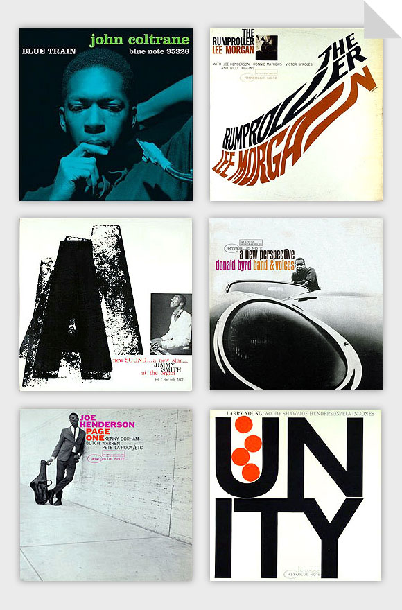
Reid Miles covers for Blue Note

Recently received a reissued edition of John Coltrane’s 1957 masterpiece Blue Train and was reminded of just how incredible Blue Note album covers tend to be.

The cream of the crop has got to be the work done by Reid Miles through the fifties and early sixties. During his eleven year tenure, he created some of the most iconic and enduring images of jazz to date. His distinct approach of combining bold color, funky lettering, and clean typography with half-toned images by photographer and Blue Note co-founder Francis Wolff left an indelible mark on mid-century graphic design. Not to mention everything that’s come since.

Before I knew anything about graphic design or music, I knew these had some serious mojo.