Old School

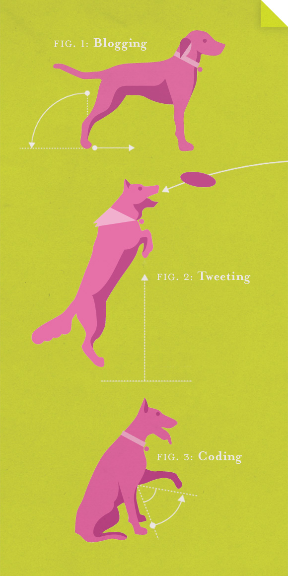
Digging through old boxes and stumbled across this little screen print from my days in JMU’s printmaking studio. Circa 2002.

Objective

Illustrations for Life With Objects

Bit late getting this up, but I had the pleasure of creating a series of small illustrations to accompany Season One of Life With Objects.

And while I’ve got you thinking about objects, I should mention that these were drawn with a piece of bamboo dipped in ink.

Gerd Arntz

Gerd Arntz was a German modernist who created over 500 icons, or isotypes, with the ambitious goal of clear communication to the illiterate masses, newly liberated by socialism. In collaboration with Otto Neurath, they strove ‘to overcome barriers of language and culture, and to be universally understood’ to facilitate the communist revolution. Not exactly my politics, but the man was a master semiotician.

They have a wonderfully curated collection over at the Gerd Arntz Web Archive.

Turn the Page

Spot illustration to accompany a “Year in Review” article in Story Matters magazine about the changing face of publishing.

W. A. Dwiggins

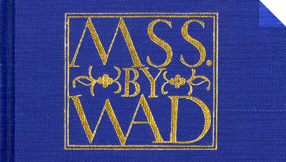
Type design on the cover of MSS by WAD

I’ve just finished a collection of stories by Roald Dahl (Someone Like You, if you care — utterly brilliant) and throughout the experience I’ve caught myself delayed numerous times by the object itself — enthralled by the meticulous typography and intricate ornamentation that adorns each chapter break. Not to mention the altogether unique cover design and spine treatment. As I rounded the last turn, I was confronted with a paragraph under the heading: PRINTER’S NOTE. What followed was a colophon of sorts that ended with the perfunctory, “The typography and binding design are by W. A. Dwiggins.”

So, who is this mysterious master of modern type and page design?

Turns out, William Addison Dwiggins, or WAD as he apparently preferred, was quite a fellow. He might be most famous for coining the term graphic designer back in 1922 in reference to himself and his work. He designed the (still popular) typefaces Electra and Caledonia and a total of 329 books for A. Knopf, Inc. The hardcover I’ve just finished bears the BORZOI imprint and will go straight on the top shelf where it belongs. Thank you, WAD.

B. Løkeland

I’d never heard of B. Løkeland until the human treasure trove of mid-century magic, Sandi Vincent posted some illustration work to her Flickr account. These are from a 1972 menu for Royal Viking cruise line that she found at an estate sale and I think they’re incredible.

All Ears

Corn Illustration

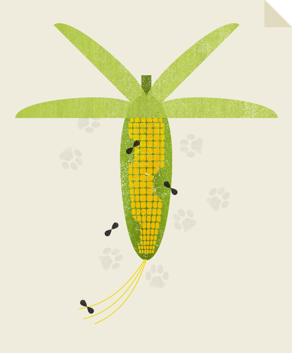
Recently completed this spot illustration for Story Matters magazine to accompany a short article about the similarities between vegetable gardens and social media.